Graphic Design, Web Design
Russian Blue Cats Website Mockup
Methods Used
Responsive Design
Style Guide/Mockups
Tools Used
Figma
Adobe Photoshop
Products Created
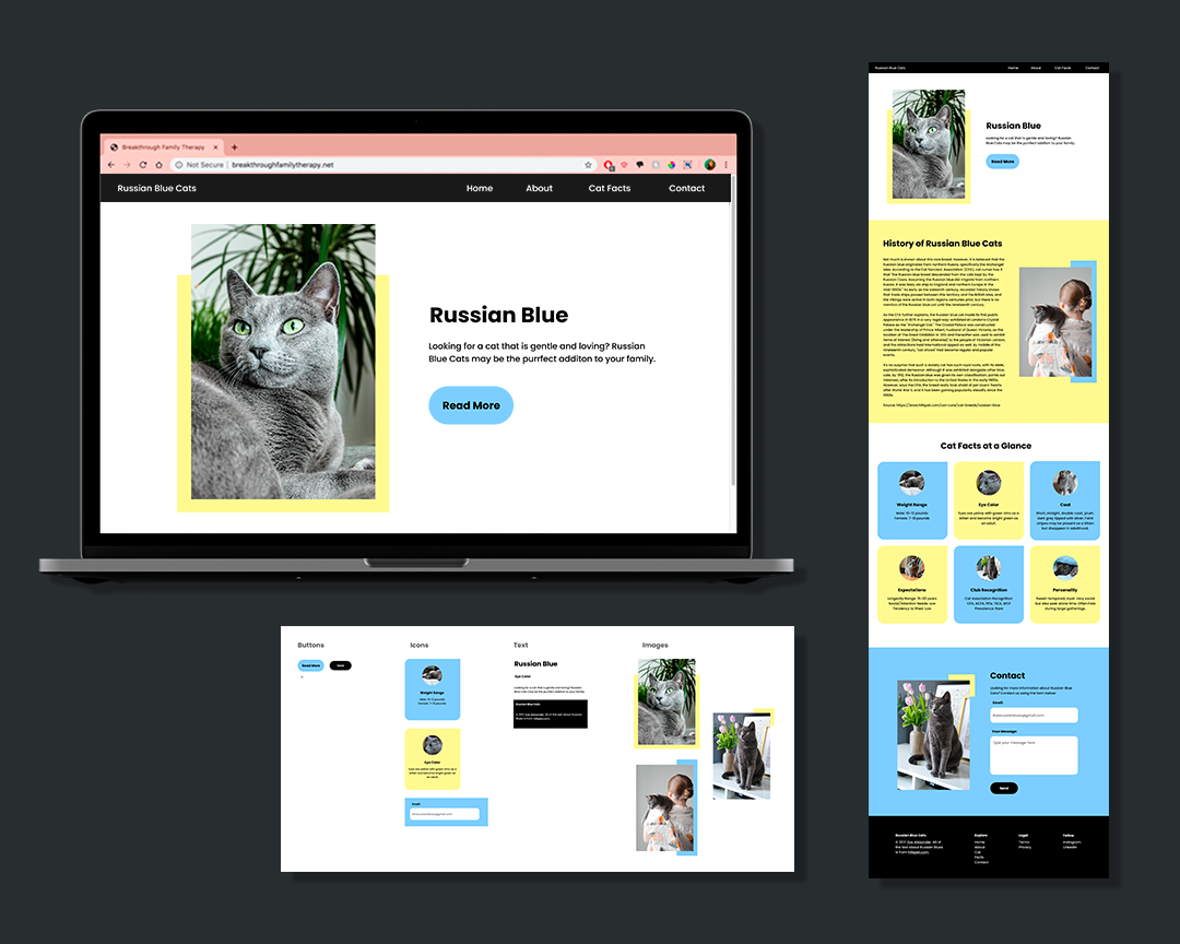
Responsive Website Mockup
Style Guide

The Project
I wanted to practice using Figma, so I decided to create mockups for a 1-page responsive website about Russian Blue cats using contemporary design.
Components
One of the amazing features about Figma is the ability to easily create components. After playing around with colors for awhile, I decided to make a website using primarily black and white with blue and yellow accents. I chose the “Poppins” font and used free stock photos from Unsplash. The results of the font, photo, and color scheme choices are encapsulated in the component guide I created below:
Website - Responsive Design
According to DMR Business Statistics*, 58% of all US internet searches come from a mobile device. This means it was essential to create a website that was responsive – meaning the site was easily viewable on any screen dimension.
Fortunately, Figma was created with this problem in mind. Using the components I made, I then created 3 versions of the website - one for desktop, one for table, and one, of course, for mobile.
Tablet Size
The tablet version is pretty similar, but I added a hamburger menu in the header and sized the number of columns down from 3 to 2 so the text remained legible.
Mobile Version
The mobile version is similar to the tablet version, but the column numbers were further reduced from 2 to 1 so the text remained easy to read.


