Web Design
French Kiss Life Homepage Replication
Methods Used
Atomic Design
Style Guide
BEM
Tools Used
HTML
CSS
Adobe Photoshop
Products Created
Replicated Website Homepage
Components Page
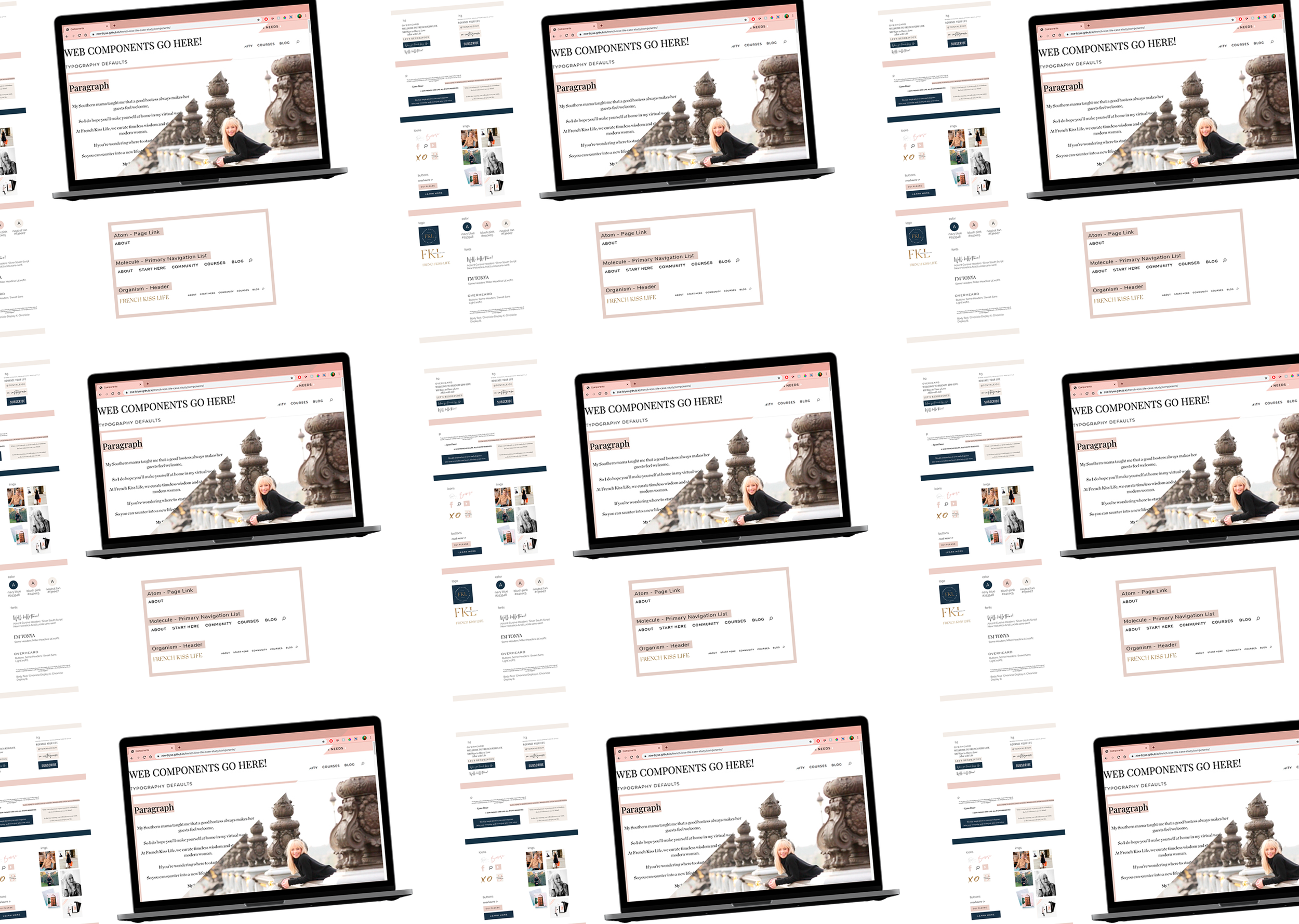
Style Guide

The Project
The French Kiss Life Homepage Case Study was the final project for my Web Development class in Fall 2019. I was tasked to find a website I liked and replicate its homepage in the desktop format (we did not focus on responsive design for this project). I had to break down the website according to Atomic Design principles, create a style guide from these components, replicate all of the components in a separate webpage, and then finally re-create the site using these components.
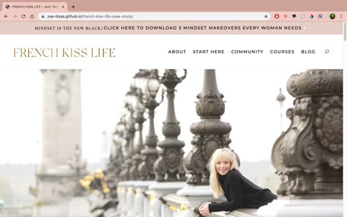
The website I chose to replicate is the “French Kiss Life” lifestyle brand site by Tonya Leigh. Since creating the homepage replication Tonya has rebranded her website to “The School of Self-Image”, but the general aesthetic remains the same:
Breakdown of Homepage – Atomic Design
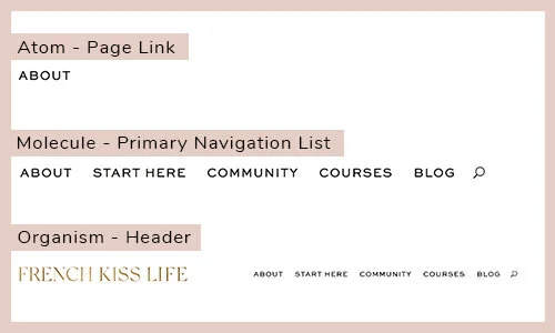
The first task for my project was to use Atomic Design principles to break down the homepage of the website. Atomic Design principle states that individual components of websites, much like almost anything in chemistry, can be broken down into three main components: atoms, molecules, and organisms.
Atoms are the smallest units which cannot be broken down any further without losing their functionality. These atoms include components such as buttons or labels.
Much like in chemistry, molecules are a group of atoms which work together as a unit to perform a certain function. This, for example, could be a search form which is made up of a label and a button.
Following the pattern, organisms are then made up of a variety of atoms or molecules. This might be a header that includes a search form and a primary navigation list.
To analyze the homepage using Atomic Design methodology, my first task was to take a screenshot of every atom, save their names according to Block Element Modifier* (BEM) naming principles, and add them all to a folder named “Atoms.” I then had to do the same for the molecules on the page and then the components, placing them each into folders titled “molecules” and “components.”
Style Guide
My next task was to use the atoms, molecules, and organisms to create a style guide. The purpose of this was to provide an overall guide of what colors, imagery, headings, and fonts were used on the website. This was so we could not only use the information to help ourselves complete the later components section of the project, but also functioned as practice for us to be able to provide a future web developers a guide to keep any website styles consistent.
To create the style guide, I looked at the screenshots of the atom components and organized them by heading hierarchy styles, paragraph styles, icons, buttons, images, logos, colors, and fonts used.
One of the challenges I had with this project was that while the website looked like it followed HTML hierarchy, the site was coded with a template instead of by hand so many of the headers were incorrectly labeled as paragraphs or used the wrong heading hierarchy. To add to the confusion, the website was also somewhat unusual in that it had about five different styles each for its h2, h3, and paragraph text instead of just one or two styles. I had to make the choice on whether to follow the HTML hierarchy used on the website, or follow what I thought was the correct choice. Since I was creating the style guide as if I was going to be handing it over to another professional web developer, I decided to follow the proper guidelines and create my style guide (and later my components) using the correct HTML labels.
Components Page
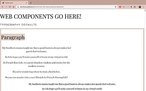
After gathering the atoms, molecules, and organism, and creating the style guide, my next task was to replicate each component using proper HTML markup on a separate component page. I used a combination of reading the CSS of the original website and trial-and-error to duplicate each component to the best of my ability.
https://zoe-blyss.github.io/french-kiss-life-case-study/components/
While the task was generally simple, some of the challenges I faced were not having access to all of the fonts and correctly spacing the components. For the fonts I had to search through Google Fonts and find the best match I could. To find the proper formatting for my molecules and organisms, I reviewed flex and grid layouts, and used those as guides to correctly space those components.
Final Webpage
Once I had finished creating all of the organisms on the components page, I had to transfer all of them to the final webpage to re-create the site.
This was in general the easiest part of the project, as when the components were added together they had most of the functions of the original site. There were only two main additions that I had to add to the CSS to make the replicated website flow like the original.
https://zoe-blyss.github.io/french-kiss-life-case-study/
One addition was that I had some trouble with making both the banner and the header have a sticky position (so it would scroll down with you on the page), but solved this creating a div block around both of them and then setting the div block’s position as sticky. I was then challenged with needing to offset one of the grids in a different section and still keeping the sticky banner’s position on top of that grid, so to fix this I added a z-index of -1 to the grid, which took care of the issue.


